Monday, March 9, 2020

Lab 04 - Conducting a Distance Azimuth Survey

Introduction

The focus of this lab exercise was how to overcome problems encountered in the field related to properly conducting an accurate survey. In this lab exercise, we gained experience in conducting a distance azimuth survey using a variety of survey methods and technologies. These include higher tech options such as GPS and laser rangefinders, to simpler ones like compasses and measuring tapes. We employed this different methods and technologies to conduct a simple survey of a variety of trees spread around the University of Wisconsin- Eau Claire campus.

Methods

To begin this survey, we first familiarized ourselves with some of the equipment we would be soon using. Some of the simpler equipment like compasses and measuring tapes are quite self explanatory and we all had experience with them. Next we familiarized ourselves with how to use the GPS unit, in this case a Garmin eTrex Handheld GPS, and the laser rangefinder, a TruPulse 360B Laser Rangefinder which can measure both distance and azimuth.

Garmin eTrex Handheld GPS

TruPulse 360B Laser Rangefinder

Using this equipment, our lab group left Phillips Science Hall and headed out to the central area of campus to conduct the survey. Our group was assigned a starting point to the South side of Schofield Hall and then picked five trees to survey. We began by recording the latitude and longitude our starting point that the trees would be surveyed from. This data was recorded in the field at the time of data collection. Still using the GPS unit, the next step was to record the elevation value in meters of each of the trees that were being surveyed. With this data recorded, we then used the laser rangefinder to determine the azimuth in degrees to each of the trees from our initial survey point. This was done by looking through the rangefinder and depressing a button on the top of the unit which automatically determined the azimuth. The next data to be recorded was the distance from the starting point to each of the trees. The laser rangefinder was used for some of the measurements, but the low sun shining in created glare and the rangefinder struggled to get an accurate measurement past a certain point. To address this issue, we simply measured the distance from the starting point to each tree using a measuring tape. Finally, each of the surveyed trees circumferences were measured which was used to then calculate the tree's diameter and the tree's species was recorded as well.

With all the data collected, the groups returned inside to enter the data into an Excel spreadsheet, save it as a .csv, and import it into ArcGIS Pro for analysis. The first step of this analysis was to create a point using the collected lat/long that represented the initial survey point for each of the groups. With this done, the Bearing Distance To Line Data Management tool was run. This tool creates line features originating from a point based on a bearing, in this case the collected azimuth data, and a distance, in this case the measured distance from the starting point to the surveyed tree. 

With this tool run, line features originating from the original survey point to the surveyed trees were created. Next, the Feature vertices To Points Data Management tool was run. This tool creates a point at the end of each of the line features originating from the origin create earlier.


With these tools run, all of the necessary map features have been created. The next step was then to create cartographically pleasing maps that visualized the survey area, the survey origin point, direction from the survey point to each of the trees, tree species, tree diameter, and tree elevation.

Results


Conclusion

This field exercise proved troublesome to complete, as some of the equipment that was used either failed entirely or failed to work as well as it was supposed to. Luckily, we had the tried and true methods of simply measuring by hand using a compass and a tape measure that proved useful. Because these methods were not always foolproof, the data seen in the maps above is not 100% accurate and true to the real world. Some of the tree points appear to be slightly off of where they should be and the azimuth's may not be exactly what they are in the real world. In addition to these problems, two groups had difficulty with data collection and entering of said data into the .csv. These two groups failed to properly collect the data and also failed to correctly determine the proper azimuth from their original survey point to each of the surveyed trees, rendering their data useless for this exercise. Even with these errors and troubles, the field exercise was able to be completed well enough to visualize all of the collected data. As seen in the maps, there are a variety of tree species present on Eau Claire's campus. Using the collected data for tree diameter, it can also be inferred that there are trees of a variety of ages present on campus.

Overall this field exercise provided us with a variety of useful field techniques that we can use in future classes or employment. These important skills of conducting a field survey under conditions that are not optimal, in this case because of failing technology, will prove very useful in the future because we are bound to run into some of these problems again.

Monday, March 2, 2020

Lab 03 Visualizations of the terrain survey data using ArcGIS both in 2D and 3D models


Introduction
            This second geospatial field activity is a continuation of the first field activity from two weeks ago where topographic data was collected at a small scale in a sandbox.  Using this collected topographic data that was entered into a .csv spreadsheet, a point-based feature was created in ArcGIS Pro. Various Spatial Analysis Interpolation tools were then run to create 3D models of the topographic data. These various interpolation methods included inverse distance weighted (IDW), Natural Neighbors, Kriging, Spline, and TIN.  The results of these interpolation methods were then compared to each other in ArcGIS Pro and ArcScene to determine which was the most effective compared to the actual site. To properly compare the results of each interpolation method, we went back out to the field site where initial data was collected and determined which interpolation method we as a group thought had done the overall best job at visualizing the topography at the site.
Methods
            The first necessary step was to import the .csv spreadsheet of collected topography data into ArcGIS Pro to be displayed at a point-based feature. This was done by using the XY Table to Point geoprocessing tool that takes an input table, assigns the data within the table to and X, Y, and Z variable, and then outputs a feature class with a desired coordinate system. The output result of this tool was a gird pf points where each point represented a point where topography data was collected from the sandbox. Each of these points have a Z value that is measured in centimeters, with some being a positive value and some being a negative value.

Figure 1. Example of table imported into ArcGIS Pro
IDW   
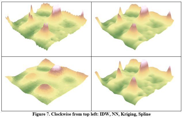
With the necessary grid data imported into ArcGIS Pro as a point feature, the various Spatial Analysis tools to create 3D interpolations of the data could be run. The first of these interpolation methods ran was the IDW interpolation. This method works by using a linearly weighted combination of sample points with the weight being a function of inverse distance. This method assumes that the influence a point has decreases with distance. Because this method uses an average for calculation, the average cannot be greater or lesser than the highest and lowest inputs, meaning this method cannot create ridges or valleys at the extremes of the input data.

Figure 2. Results from IDW interpolation method

Nearest Neighbor
The next interpolation method run was the Natural Neighbors Spatial Analysis tool. This method works by finding the closest subset of input samples to the point being calculated and weighs each of those samples based on the proportional area. This method can also not produce ridges and valleys unless they are from the value of a direct input because height values generated are within a range of the sampled values.

Figure 3. Results from Nearest Neighbor interpolation method 
Kriging
            The third interpolation method used was the Kriging Spatial Analysis tool. This method is considered an advanced geostatistical method that works by creating an estimated surface based off various points z-values. This method employs autocorrelation and assumes that the distance and/or direction of sampled points is indicative of a spatial correlation. Because of this, the Kriging model can not only create a predictive 3D surface but also determine the level of accuracy of said surface.

Figure 4. Results from Kriging interpolation method 

Spline
            The fourth interpolation method used was the Spline Spatial Analysis tool. This interpolation method works by estimating surface values using a function so that overall surface curvature is minimized and a smooth surface that passes directly through the data points is created.

Figure 5. Results from Spline interpolation method

TIN
The final interpolation method run is the Create TIN 3D Analyst tool. This tool creates a triangulated irregular network (TIN), which is a form of vector-based data created by triangulating sets of vertices. These vertices are the individual data points and their Z-values that were imported into ArcGIS Pro earlier. In this tools case, the connected vertices and their edges form non-overlapping, continuous facets which is ideal for capturing linear features such as ridges.

Figure 6. Results from TIN creation
           
With each of these tools run and the outputs saved, ArcScene was opened to view these outputs in a 3D environment. To do this, a base height for each of the 3D surfaces was set to a meters to feet floating on a custom surface value. Once all of the 3D surfaces that had been created were viewed in ArcScene, our lab group returned to the sandbox where we had collected topographic data and compared how the sandbox looked to the results seen from our created 3D surfaces.

Discussion
            Based on the results from each of the interpolation methods used compared to the actual sandbox where topographic data was collected, it appears that the Spline method produced the best representation of the real-world model. The reasons for this are that it is the smoothest of the four spatial analysis interpolations methods used for this example. The IDW method produced a pockmarked surface where each of the locations where data was collected are visible. The Nearest Neighbor method produced a surface very close to the Spline method but there was still a small amount of jaggedness present near some of the larger jumps in elevation.  Finally, the Kriging method did produce a surface model that was less vertically exaggerated but was still jagged in many ways and did not represent the smoothness present in the real-world model.

Conclusion
            At the end of this lab exercise, myself and my lab partners had gained valuable experience in collecting and analyzing topographical data. Of the many interpolation methods that we employed to convert our collected data to a 3D surface, some specific methods ended up working better than others, with the Spline method outputting the best surface model that was the most similar to the real world sandbox model. The various skills that I have gained through the course of this lab exercise will be valuable both in my future education and in my future geographic exploits.

Tuesday, February 25, 2020

Lab 02 - Familiarization With ArcGIS Desktop DEM Raster Tools and ArcScene

Introduction


The goal of this Field Methods lab activity was to familiarize us with the various spatial analysis tools that are commonly used on DEM raster files in ArcGIS desktop applications.  Understanding what each of these common tools does and the products that will be created upon running these tools was also an important goal of this lab.  Finally, another goal was to gain experience in the viewing of DEM raster data in a 3D platform such as ArcScene

Methods


To begin this lab, provided DEM data was copied into our individual class folders.  This data, had it not been provided for us, was obtainable through the WI DNR or through the USGS.  With this data, we opened ArcGIS desktop and created a file geodatabase to house the data in each of our individual folders.  With this done, the final step before processing the data was to turn on the Spatial Analyst extension under the Customize menu to allow for the use of Spatial Analyst tools.

With these set up steps complete, the first tool to be run was the Contour Tool found under Spatial Analyst>Surface>Contour.  This too creates contour lines at a user set interval, in this case 10 meters, and exports the output as a layer that can be added to a map document.

Figure 1. 10 meter contour interval of Eau Claire County DEM

The next Spatial Analysis tool to be run was the slope tool, found under Spatial Analyst>Surface>Slope.  This tool creates a raster file showing the relative steepness of slopes based off an input DEM.
Figure 2. Slopes of Eau Claire County DEM

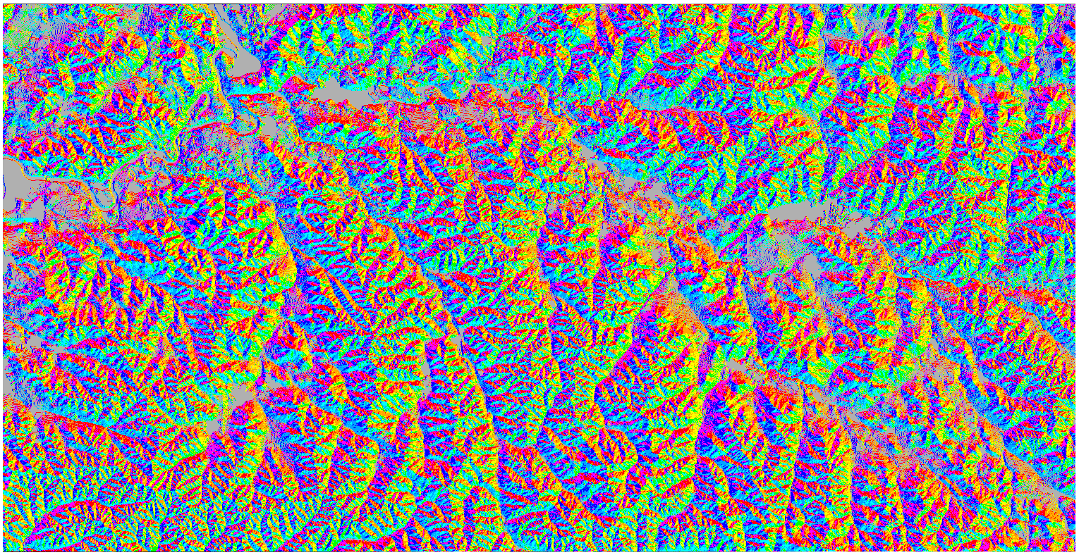
The next tool after slope was the aspect tool, found under found under Spatial Analyst>Surface>Aspect.  This tool determines the aspect, or the cardinal direction, that each slope faces.
Figure 3. Slope Aspect of Eau Claire County DEM

The final Spatial Analysis tool to be run on this DEM is the Hillshade tool, found under Spatial Analyst>Surface>Hillshade.  This tool creates a shaded relief of a DEM that allows for better visualization of the topography of an area.
Figure 4. Hillshade of Eau Claire County DEM

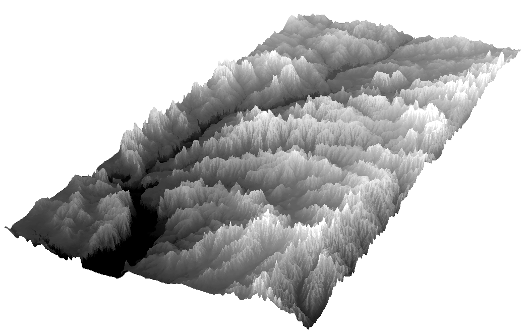
Once all of the Spatial Analysis tools had been run, the next step was to visualize the DEM in ArcScene.  This was done to express the DEM in all three dimensions rather than in 2D like in ArcGIS desktop.  To do this, the DEM was set to 'floating on a custom surface' either by meters to feet, feet to meters, or based on a custom value.  These values determined the overall vertical exaggeration of the DEM.
Figure 5. Eau Claire County DEM shown with different levels of vertical exaggeration.

Discussion


This lab was very straight forward, with simple easy to understand directions that guided us students through the lab to accomplish the goals of the exercise.  

Conclusion


Overall this lab was very useful in developing my understanding of some of the spatial analyst tools present in ArcGIS desktop. this lab was also great in allowing us to gain more experience in working with DEM's both in ArcGIS desktop and ArcScene as well.

Evaluation

1.     Prior to this activity, how would you rank yourself in knowledge about the topic. 
         4-A good amount of knowledge
2.       Following this activity, how would you rate the amount of knowledge you have on the topic
         5- I am an expert)
3.       Did the hands-on approach to this activity add to how much you were able to learn.
         4-Agree
4.       What types of learning strategies would you recommend to make the activity even better?
          More in depth use of these spatial tools for a wider variety of applications.

Sunday, February 16, 2020

Lab 1 - Creation of a Digital Elevation Surface using critical thinking skills and improvised survey techniques


Introduction
                The goal of the first Geospatial Field Methods lab activity was to collect the data to be used in the creation of a digital elevation surface to be created in a later lab exercise. This was accomplished using a variety of survey tools and sand boxes with pre laid out grids located on the eastern side of Phillips Science Hall on the lower portion of the University of Wisconsin – Eau Claire campus.  The collection of this elevation data was done in a small group with all group members contributing to the effort of data collection.  This lab was designed to hone our critical thinking ability as well as to give students more experience in common field techniques such as those used to survey a site and collect topographic data.

Methods
                To begin this lab exercise, the class left Phillips Science Hall and headed outside to the location of the sandboxes to be used for this lab.  These sandboxes had not been used in months and were therefore covered in many inches of snow and ice and required clearing before the lab exercise could begin.  As a result of the large amount of snow build up, some strings marking out the grid were dislodged and required fixing. With the sandbox ready, the group began adding snow to certain areas of the grid and carving out divots in the sand elsewhere to create a varied topography.


Figure 1. Preparing the sandbox

                With the grid complete and the desired amount of variance in topography reached, measuring and collection of elevation data then began.  To do this, a meter stick was used to measure the distance from the sand and snow to the level of the grid strings which represented sea level, or 0’ in elevation.  Data points were collected from the center point of each grid square and spray paint was used to mark which of the grid columns had already been collected as data was collected column by column originating from a 0,0 point in the lower corner. Each data point was collected to an accuracy of 5 millimeters and recorded in a table that had the same number of rows and columns as the grid over the sandbox had.
Figure 2. Collection of elevation data points

                Once elevation data for each of the grid squares had been collected, the group recovered the sandbox and came back inside to begin the process of data entry in an Excel spreadsheet.  This spreadsheet was formatted in a way with X, Y, And Z values that would best allow for the transfer of this elevation data into a GIS for the creation of a digital elevation model.
Figure 3. Examples of collected data in Excel spreadsheet

Discussion
                An important component of this lab was to develop and hone our ability to think critically both as an individual and as a group.  This lab contained little direction which therefore forced us to think about the steps that were necessary for us to take rather than simply follow directions that were provided by the professor. Although this proved to be a hurdle at first, the group came together to properly solve the problems that presented us. While the main problems of this lab exercise were solved and overcome, there were some other slight problems that could not be solved.  The first of these problems was the accuracy of the data collection as the grids were not perfectly aligned and measuring the height of the strings from the sand/snow was not always a perfectly accurate job as the meter stick would slightly sink into the sand or snow which meant we had to be very careful when measuring.

Conclusion
                Overall this lab was useful in developing our ability to think critically about a problem that we received little guidance to solve.  This lab also helped develop our problem solving and teamwork skills to solve a problem that would be found in the field.  The more experience in field work gained through the completion of this lab was also quite useful to my development as a student of geography.  The information gathered in this lab will be used for future lab exercises and the skills that have been gained in this lab will be used not just for future labs, but for future classes and employment as well.

Evaluation
Prior to this activity, how would you rank yourself in knowledge about the topic. 
4-A good amount of knowledge
Following this activity, how would you rate the amount of knowledge you have on the topic
5- I am an expert)
Did the hands-on approach to this activity add to how much you were able to learn.
4-Agree
What types of learning strategies would you recommend to make the activity even better?

       A larger sandbox to conduct this lab at a larger scale.